2017-2018 school year
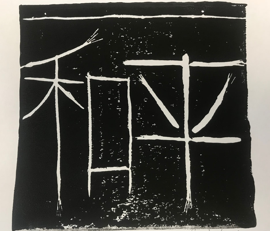
Peace, Block Print
My artwork is a character design using the Chinese characters that spell out "Peace".
I created this peace by cutting off a 5" X 5" rubber pad and using carving tools to carve the characters in reverse. I then inked the surface of the pad and flattened it against a sheet of paper to transfer the ink from the pad to the paper. I then lifted the pad and the piece was complete.
I chose to make this because I wanted to experiment with a new art medium, and also because I feel that everyone needs a little peace in their life. The best way to express that was with the chinese characters.
The challenges that I had faced were remembering to carve the characters in a mirrored fashion so that they would ink in the right way on the paper. I also had some trouble keeping the same depth with a few of the carvings, and I had accidentally inked one side of the paper that I wanted to keep white.
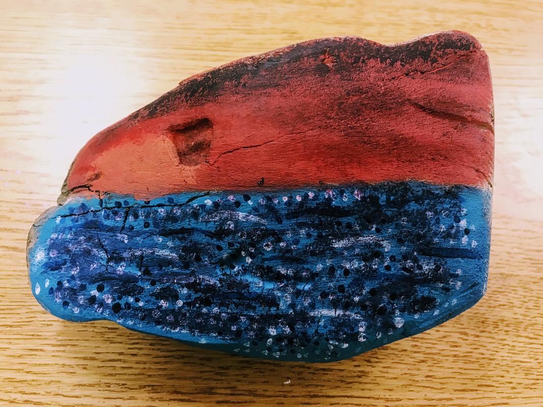
Home, Drift Wood and Paint
My artwork pictured here is a piece of driftwood that I had painted a sunset on, a common image that I would have viewed where I used to live.
I started to form the idea in my head when I found a piece of driftwood lying in a drawer. Seeing the small, semi-flat piece of wood reminded me of all the times that I used to find washed up driftwood at the beach in my home town. I got the idea for a sunset because in my mind, nothing is better than viewing the sun setting on the town that you grew up in.
My artwork expresses where I am from. I come from a town that was mostly focused on fishing, swimming, boating, and all kinds of exports from the water. My town, Manistee, is known as a "Victorian Port City," meaning that it was a functioning victorian era port during the 1800's. All over the town, there are houses still standing from when they were built almost one-hundred to two-hundred years ago. Coming from such a beautiful place, I wanted to represent it in a way that reminded me of the place.
|
|
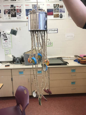
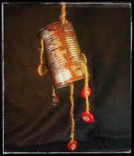
CANdellier, Trash and natural fiber rope
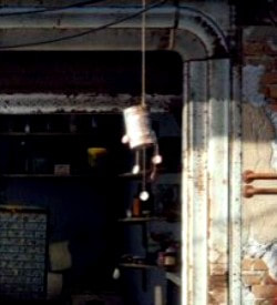
The piece that I created, pictured at the far left, is a real-life replica of a piece I saw in the game, Fallout 4. The piece was a simple wind chime made from an old tin can, some rope or twine, and a few bottle caps.
I decided to make this because I am a big fan of the game, and I wanted to make something that came from it, something that I could keep and take home as a decoration. I got the idea one day after starting up the game, and noticing that the can was there, made with bottlecaps, even though bottle caps are the currency in the game.
To make the decoration, I drilled holes in the top of the can, and then cut different lengths of natural fiber rope and tied knots in them that prevented them from falling all the way through the holes. I then acquired some bottle caps, and drilled holes in those to tie the ropes through. Altogether, it took me a few weeks to make three CANdelliers. The most time consuming parts of the project were tying the knots and acquiring the bottle caps.
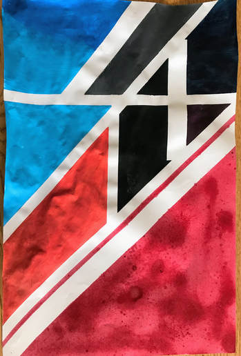
Fly Your Colors, Masking tape, acrylic paint, and plain white paper
The piece above is a series of lines and shapes made by taping off sections of paper and then painting in the parts of the paper that are not covered in tape. I had decided to try this because I noticed everyone else was making something using this process, and I wanted to see what I could do with the same material and process
When I painted the piece, I first used spray paint to cover a large amount of space in a short amount of time. Then, when the paint dried, I began using acrylic paint, and I was mixing them and painting indiscriminately, with no real method or code for colors. I just put whatever I wanted on the page, irregardless of clashing colors.
Looking back at my piece, I now see that there are some abstract designs that show up, like letters and numbers. When I finished my piece, it surprised me just how well the colors came out, and how clean some of the painted lines were.
A black and white copy of original photo, to remove the weird blue that showed up.
The original photo.
|
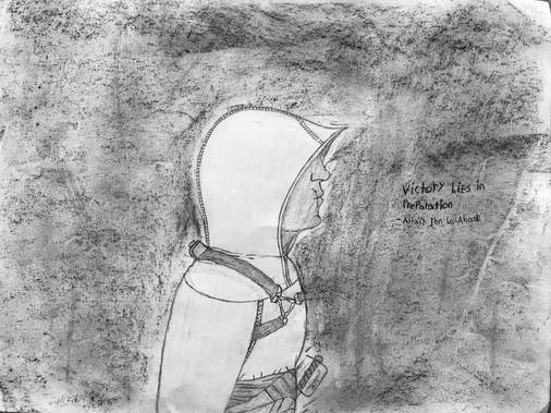
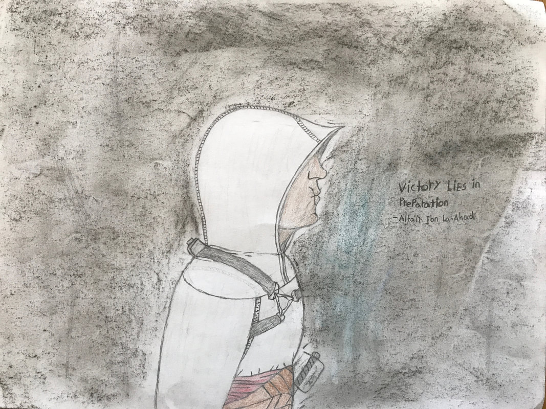
Victory Lies in Preparation, Pencil, Paper, Colored pencils, Chalk Pastel.
My artwork depicts one of my favorite characters from one of my favorite game franchises, Assassin's Creed. I recently began playing the first game, and it reminded me of just how awesome and cool the main character, Altaïr, really is. A few of the challenges that I faced when creating the piece were making sure to correctly proportion the head to the rest of the body, and to give definition to the rest of the body. I also struggled with finding the right colors for the piece, and trying to keep the lines I drew from smudging. When creating the piece, I imagined the scene that the character was standing in was one where he was slightly looking up, so that I could draw the bottom of his face and chin slightly protruding from his hood. I also wanted to make the nose more prominent, trying to get the features racially correct. It had surprised me just how well the original had turned out. I'm not very good at drawing humanoid figures, so when this turned out to be really nice, I was excited. I also became aware of the fact that with a plain white background, the piece looked kind of boring, so I used the black chalk pastel to shade in the back, giving it a bit of depth. |
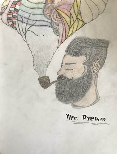
Pipe Dream, Pencil, paper, colored pencil, outlining marker.
I'm not entirely sure what drove me to draw this piece. I can say, without a doubt, that the T.V. show Disjointed had something to do with it. I guess I just wanted to experiment with what patterns and colors I could combine, and wanted to see the end result.
The reason why I chose a hipster-type person as the subject of the art, and why I chose a pipe instead of, say, a cigar or cigarette, is because I think pipes are a little more classy, and because I believe the only people who smoke pipes these days are old people and hipsters. But the reason why I didn't choose an old person is because I wanted people to have at least some connection: People smoke so they can relax, and what better relaxation is there than sleeping, or at least daydreaming, while smoking? I know it's bad for you, but from an outside standpoint, it's something that I wanted to try and depict.
The reason why I chose pencil to do it in is because I favor pencil and paper over other art types: it's cheap, hardly any mess, and if you mess up, you can always fix it. The steps I took to draw this were fairly easy steps. I searched online until I found the image of the bearded man, and while looking at the image, I made the man real, and put him onto paper: first by outlining the general head shape, then by adding small details here and there, some as part of the original, and some being my own design. I then added the pipe in his mouth, and tried to detail it so that it looked as much like a wooden pipe as possible. I then added the smoke cloud, and just took off from there. When I added color, I wanted the pipe to look like it had a brass bowl and stalk, and used whatever colors I had available for the designs in the cloud.
While making this, I discovered just how easily it was to change the way hair looks; it could be thick if you press your pencil against the paper harder, or it could be thinner if you use little, light strokes that continue sporadically. I also learned that it was easier for me to draw something complex while I'm looking at a reference photo of it, rather than being shown a photo once, and then trying to recreate it later. I'm beginning to wonder what other things I could draw that almost resemble this. Due to popular feedback, I would like to make another, or one like it. I guess either time or boredom will tell.
|
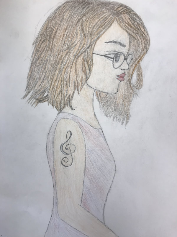
The Girl With The Tattoo, Pencil, Paper, Colored pencil
I commissioned this piece as an entry for my school's "March Art Madness" competition. I know my skill set: good with paper and pencil, unskilled in everything else. So, I did another thing, almost exactly like Pipe Dream. I went online for a reference, and when I found it, I began drawing. The original photo was black and white, and the girl was wearing a black dress. In my rendition, there's color. The girl is wearing a multicolored dress, has red lips, blue eyes (unnoticeable in the photo here), auburn hair, and a signature blue treble clef tattoo. When I made it, I kept in mind the idea of what would impress people. For instance, I figured out that some people are taken by drawn art versus computer design because of the skill it takes to draw; I also know that having color of some kind can make a picture look less boring (however, if I had known anything about shading, the picture would have looked a bit less two dimensional). I also implemented the same technique with the hair design, making the hair on the top of her head seem like it was flowing down to all sides. Finding the subject for the photo was somewhat of an oddity: as I was looking through the endless pages of Google Images, I was being drawn to one specific picture. I have no idea why I chose it, other than what I had seen in that photo was the perfect muse. I'm beginning to wonder what other kinds of techniques and pictures I can try, because I have a fascination with paper and pencil. It's just so easy. And I hope to one day have the ability to actually draw hands! Because, even though I see them every day, and study them as much as I can, I have no idea how to draw them proportionally to the person. |
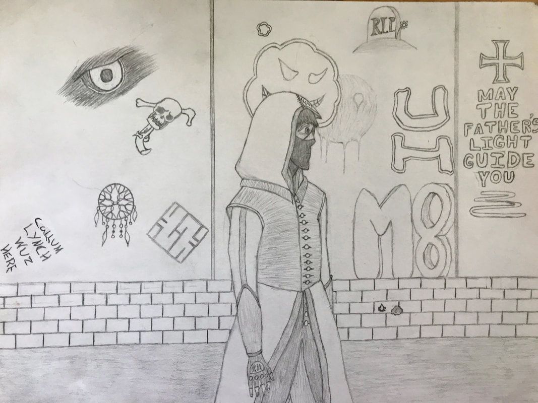
The Modern Bureau, Paper and pencil
It's no secret that I like the game series Assassin's Creed. The fact that there are two secret societies warring with each other in the shadows, with their actions never being noticed by the general public is amazing. I've played almost every game, since they first came out when I was young. I've watched the movie, and followed the stories. I've read many of the pieces of lore they have, and have fallen in love with it. So, I wanted to imagine what the Assassin's Bureau would be like in the modern day, in a busy city, like New York. Yes, the outlandish clothing would make them dead-easy to spot in a crowd, but that was kind of the point of how they dressed. Having the face covered would help if people were trying to look for them. And this specific character has an eye patch, probably because he had his eye shot out, or stabbed. He lost it somehow.
The main focus of the piece was not the character, but the background. It was supposed to showcase an element from every game, from the first, to the most recent. I also added an element from the movie, and basically, the essence of the game: the silent fight between the Knights Templar and the Assassins.
The few things that I struggled with the most were trying to find other pictures to add to the background, and to work on the dude's freakin' hands! Despite how often I see them, and how much I study them to use them as models for drawings, I just cannot find a way to make what I see in my head appear on paper. It's weird.
However, despite all of this, I became more confident in drawing human figures. I based this one off of my own body type: slim, broad-shouldered. Not the biggest, but not the smallest person either. Able to get in, do what needs to be done, and get out. I also have a better handle on hood shapes, and human faces. What surprised me the most was being able to change the texture of clothing with only a few horizontal and vertical lines. I took a flat white vest and made it seem like a grey pleated vest, or one that has folds weaved right into the fabric.
2018-2019 school year
|
Mosaic WIP (Work in Progress), Paper and glue
With this piece, all I have are the first few rings. I plan on making more of them out of the colors that I have underneath the mosaic, and making them with even more uncommon designs instead of the normal cube design. I got the inspiration for this from my shower curtain, which has a mosaic pattern. I've always thought that mosaics were pretty cool, because you're taking hundreds, sometimes thousands, or maybe even millions of tiny little pieces and assembling them into much bigger pictures. I enjoy the time and effort that must be spent on creating these, because it is calm and peaceful. It allows me to reflect on what I am feeling at the time, and even work through the problems that are causing these feelings. A few of the challenges that come with doing a mosaic out of paper is messing with the glue and getting the paper cut in the right way to fit in the pattern. |
|
|
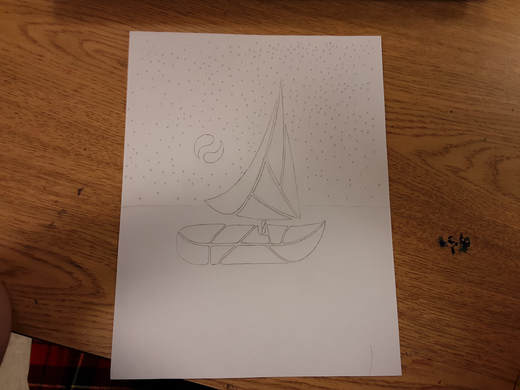
Unnamed, Pencil and Paper
I am not sure why I decided to draw this. One day, I just felt...I don't know, lonely? Like, you can feel lonely without actually being alone. And I decided to convey that in a way that looks like it. A lone sailboat on the open water at night. No other boats out. No city lights. Just the moon, the stars, and the water. The reason why the boat and moon are drawn with shapes instead of being one whole piece is because I was trying to prove something to myself; I wanted to show myself that I could make something recognizable out of basic shapes. An artwork that influenced my piece is a pointillism piece that another student in my class is working on. I saw how she had them arranged into shapes, looking like an umbrella. My points are only stars, seemingly put at random. This week I actually drew and defined what parts I want and where I want them. Later on, I may either add more detail or begin to color my piece. I may just leave it as a black and white. |
|
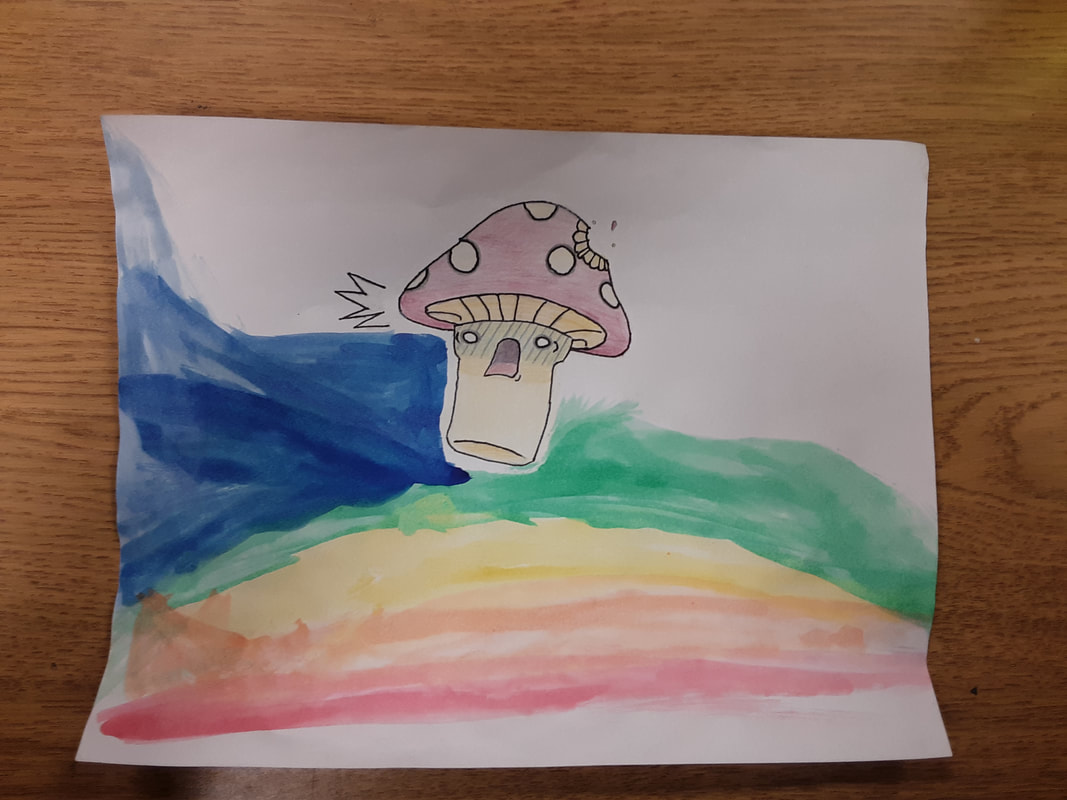
WIP: Surprise, Paper, pencil, colored pencil, oil pastel, water colors
I saw a picture online that I really resonated with. I thought it was kind of cute looking, and wanted to make it for myself. So, I saved the image to my phone, cropped out the part that I wanted, and then began to draw it. After that, I needed something that would make it my own, so I added the bite that was taken out of the crown. I had finished putting it together. But something was still missing from it. It looked lifeless, without any real expression. So I colored it as best as I could. When the mushroom was done, it finally had something going for it. It was all colorful and cool looking, and I was satisfied with it. I outlined a few spots to bring out the lines, and I called it good. When I entered it for a peer review, I was told there was too much negative space, and that I needed to fill in some spots.
I saw a picture online that I really resonated with. I thought it was kind of cute looking, and wanted to make it for myself. So, I saved the image to my phone, cropped out the part that I wanted, and then began to draw it. After that, I needed something that would make it my own, so I added the bite that was taken out of the crown. I had finished putting it together. But something was still missing from it. It looked lifeless, without any real expression. So I colored it as best as I could. When the mushroom was done, it finally had something going for it. It was all colorful and cool looking, and I was satisfied with it. I outlined a few spots to bring out the lines, and I called it good. When I entered it for a peer review, I was told there was too much negative space, and that I needed to fill in some spots.
Undaunted, Paper and pencil
The two figures, locked in an epic staring contest. One, a proud free lance knight hired by the nearby kingdom. The other, a ruthless dragon whose only joy and vice is his hoard. Both of them, waiting for the other to make the first move.
I decided to draw this picture because I wanted to see just how well I could. It's been a while since I decided to just draw something from scratch, instead of picking a theme and trying to find something from the internet that fits that theme and drawing it. Like all of my drawings, this one started with a curved line. After making that line, I started to picture a helmet. Then, after the helmet, armor. After the armor, a shield, and after a shield, a sword and scabbard. I then decorated the helmet with a horse hair plume, and made it seem like there were individual hairs coming out of it.
After making the knight, I needed to make an opponent. Something that would not only take up the other half of the page, but would also make the picture interesting to look at. So I decided it had to be a dragon.
I've drawn dragons before, so I figured it wasn't going to be a big deal. But after I had put one of my dragons on the page, I soon realized that it wouldn't be enough. It couldn't be one of my dragons, because mine look like cartoons. It had to be a more detailed looking dragon. So, I searched for a reference, and then drew my version of that reference on the paper. I then detailed both figures even more, snapped the photo, and added it here. The picture from here on will be on display in the hallway of Galesburg-Augusta High School.
Stitch (Lilo & Stitch), Paper & pencil, colored pencils
I had recently seen the film Lilo & Stitch, which was a movie that I remember from my childhood. When I was younger, I never understood the subtle nuances and small details that the movie had. I just watched it because Stitch was an alien who was prone to causing a lot of destruction. But as I got older, I became wiser. I was able to watch the film and see all of the small things that normally would have gone over my head as a child. Some of the subtle, adult jokes, and more of the darker details that made the movie a good movie.
After viewing, I wanted to draw one of the characters, the little blue alien named Stitch, also known as Experiment 626. I'm not exactly sure why I wanted to draw him. All I know is that I wanted to make a character that would be widely recognized, and test my abilities as an artist to recreate such an icon.
When drawing Stitch's head, I first tried to approach it the way I normally do: start by making one of the ears, and then drawing the rest of the head from there. After that had proved to be a terrible idea, I started to draw the traditional way (making an oval for the head, then adding a dip where the mouth should be, and finally adding the ears and other details). After I had finished the head, I began to draw the rest of the body in my signature way, and I had finished. I added in the other details, took my pictures, and went on. When I could access colored pencils, I picked the four that would best match the original colors, and I colored Stitch in.
|
|
#Gamers, Paper & pencil, Colored Pencil, Computer Aided Design
I got really bored one day and decided to search Pinterest for ideas of what to draw. I kept scrolling down, not satisfied with what I was seeing, until I saw something that made me think. It was an idea that said to "Draw an English muffin," and in the picture, there had been a muffin with a handlebar mustache wearing a monocle. It had sparked an idea that I had had a couple of months ago. I kept thinking about my gamertag for Xbox live. LavishChip463. I kept thinking about what the words meant: Lavish is to do something expensively or with expensive taste. A Chip is, depending on what country you're from, either a potato chip or a steak fry. I decided to go with the European chip, because I wanted my thing to have more definition. So, I drew the real-life version of my Xbox Live Gamertag. I started to get into the whole idea of creating real life versions of Gamertags, but only the ones that made any iota of sense. I then began asking my friends what their tags were: I have a friend who's tag is "XoticPineapple" and another who's tag is "candypickle18". So, I decided to draw them. It was hard deciding on how to present the drawings, and with the LavishChip463, it was hard finding a way to add the label. At first, I scanned my drawing into the computer using a copier, and then I had to figure out a way to make a label and add it to the picture, which had me using GiMP, which was very difficult as I had never used GiMP before. |
|
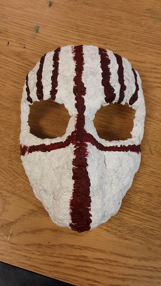
Tribal Mask, Paper Smache, red and black acrylic paint
I don't remember when I had wanted to make the mask. I just remember that I wanted to. Not to wear, but to hang or display in my room. I don't have any ties to any mask wearing peoples of the world, and the designs on the mask have no special meaning to me. They are just there to enhance the look of the mask and to make the white expanse a little less bland. However, I love the way that the dark, almost blood-like red contrasts against the stark white. It makes me feel as if the designs were made with blood, something I tried to capture. I also did not want to add any anthropomorphic features like a mouth, lips, defined nose, or eyebrows because I wanted it to be a little disconcerting to look at. You see a face that looks eerily similar to a person, but it does not share any other features besides a general shape. A few things that were difficult when forming the mask were using a model to form my mask to. I had to find and borrow a Styrofoam wig holder to use as a head. I then had to keep adding and molding the paper mash to the face, which had a whole slue of problems, like cracking when drying due to shrinkage, falling off of the face, and making the head heavier on one side, meaning that it was difficult to balance the head while the mask was drying. Mixing the paint was difficult too, because I had to find the right ratio of black to red. At first, I had mixed in too much black, turning the paint into a weird burgundy color, and not the crimson that I needed. I had to mix the paint for a second time, this time with less black, and managed to find my color. I am satisfied with my mask, and will now try to find a way to add some string or wire to the back of it so that I can hang it on the wall in my room. |
|
The Last Airbender Is Penguin Sledding, Paper and Pencil
I had recently found a show that I used to watch a long time ago called "Avatar: The Last Airbender." I had found the first season floating around Facebook, and had decided to save it so that I could watch it later. After finding the first season, I figured that I should look to see if they had the other two seasons somewhere. Lo and behold, I was correct, and I decided to save the other two as well to watch. I began to watch the first season a while back, and I noticed that the animators had drawn some very funny character designs when they had to make a few of the scenes, one of them being the time when Aang, the Avatar and the last person able to control the power of the air, is sledding down a hill on the back of a penguin (I know that, in the picture, it does not look like a normal penguin. The designers made their own versions of animals for the show.) I thought the face that he made was funny, and I decided to take a screenshot of the scene and save it for later use. This is not the only screenshot that I have taken, and there certainly will be more to follow later. A few of the things that I noticed that were going to be problems right away are that I am not very good with making colored images. My only success in that area was with Stitch. I had to figure out a way to use only black, white and grey to represent the different color values. Which gave rise to another issue: solid lines separating different areas of color. I couldn't let that happen, so I had to learn how to use blending tools to try and smudge the lighter and darker areas together, so that it transitioned between light and dark without having a solid line between them. My only other struggle was making the background, and trying to show the snow trailing behind Aang. This is another instance where a blending tool was used, and the lines between different values were smudged. |
|
|
|
Air Force Graduation Cap Design 13 May 2019, Felt, Wax paper, Paint, Paint - Fabric Medium
Well friends, the time is almost upon us. Pretty soon, I will have the honor of having my name called, and walking across the stage to collect my diploma, and then continue to work towards and live the rest of my life. So, to commemorate that moment, I decided to add to my cap the logo of where I will be going right after high school: The United States Air Force. For a long time now, I have been speaking with a recruiter about what I can do after I graduate, where I can go, what opportunities that will be available to me. She said that, through the Air Force, I could literally do anything that I set my mind to. Now, after taking all of my tests, going through all of my inspections, and a very long wait for a waiver to be passed by the Surgeon General them self, I can happily say that, after graduation, I will be an official member of the USAF. For the actual decoration, it was a long and complicated bit of design process, cutting, adhering and painting. I had to cut out a 9 1/4" by 9 1/4" piece of card stock paper so that I could accurately cut out a piece of 9 1/4" by 9 1/4" piece of felt, the fabric that the design would go onto, and a piece of wax paper to use as my stencil. After the stencil was drawn onto the wax paper, I used an x-acto blade to carefully cut the design out, and then I ironed the wax paper onto the felt. Mrs. Niesen had doubts that the felt would work, and actually thought that it would melt, but because felt is not a synthetic fiber, but a wool product, the process with the iron worked amazingly. After ironing on the stencil, all there was left to do was paint the design. I mixed together some blue and white acrylic paint, which took quite some time to get the mixture correct, and then added some fabric medium that would allow the paint to stay on the fabric. I then began painting, and after a few days of finishing different sections and then going over it all with a second and even third coat, I finally finished the decoration. I will say, from personal experience, nothing is more satisfying than peeling off the wax paper from the felt. The way it just pulls away gives me goosebumps. |
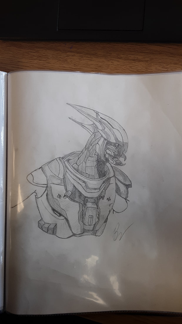
Sangheili Warrior 22 May 2019, Pencil, Paper
This is another design of a video game character that I drew. I found a concept art image of an alien from one of the games I play, HALO. HALO: Reach, specifically. When I saw the image, I knew that I wanted to attempt my own hand at putting this creature to paper. The creature itself is called a Sangheili, from the planet Sangheilios, which has been allied with religiously fanatical cult, called the Covenant, for many centuries. The humans who fight these creatures call them the Elites, because they hold special positions of command due to their long history with the Covenant. You usually see one or two groups of enemy Grunts, called Unggoy, being accompanied by a few Elites. In the game, they are one of the more tougher enemies, depending on which subclass they are. This specific subclass of Elite is nothing more than a sergeant of some kind, because his armor only covers his extremities, and is not highly decorated.
I do not necessarily remember the process I went through to start the drawing. I think I started with the head first, and then worked my way down the neck later. I first put all of the shapes onto the page, and the general designs, and then I started looking more carefully at the image to get the gradients correct for the shading. I stopped at the arms because I knew that I wouldn't be able to move on farther than them, and also because I just didn't feel like drawing the rest of him. I figured that what I had finished already was enough. Some of the difficulties I had were with the helmet piece, and the bit of the armor that goes behind the neck. I also had a hard time with the left side of the armor (the portion facing away) because the right side is more prominent. When I was shading, I thought it was going to be difficult for me to shade the colors correctly, but then I figured that I would be working in black and white, so it really wouldn't matter. After finishing, I put the picture in a page protector, and it now sits with my other more treasured drawings.
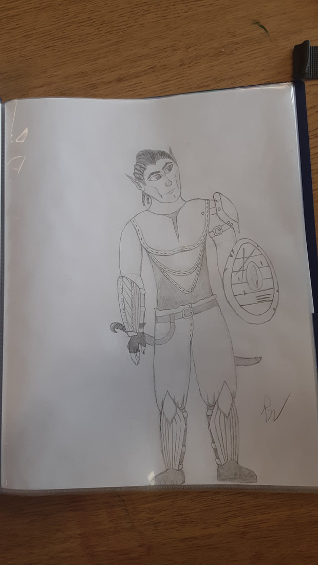
Elf Warrior, Paper and Pencil, 28 May 2019
This is another fantasy character that I had decided I wanted to draw. The inspiration for this one came from going through a few posts in a Dungeons & Dragons group that I am a part of on Facebook. I saw people asking for character descriptions so they could be drawn, and others were sharing their drawings of their own characters. At the time, I was also experimenting with frameworks for humanoid figures, so I figured that, since I had made a female figure, I needed to make a male figure as well. I started the drawing with his general head shape, and mapped out where I wanted his features to go. The ears were actually the easiest part to draw, because all I had to do was draw lines going slightly oblique to the perpendicular of his face. I then began to draw the framework for his body, and I had to keep in mind that, since he was an Elf, he had to have a slender frame. So, After creating the framework, I had to add detail. I drew the left shoulder pauldron, then finalized where his trousers would start, and then where his boots would start; I made his weapon, his right arm bracer, I added the glove to his right hand to insinuate that being his sword hand, even though the handle should be on the other side of his body. I then added the shield, because I did NOT want to draw another hand, and then added all of the smaller, minute details later. The hardest part about this drawing were the hands and the feet. I had a general idea of what I wanted everything to look like, and I went with that, but sometimes they turn out a little...iffy. However, I am happy with how this turned out. I think this one went really well.
This is another fantasy character that I had decided I wanted to draw. The inspiration for this one came from going through a few posts in a Dungeons & Dragons group that I am a part of on Facebook. I saw people asking for character descriptions so they could be drawn, and others were sharing their drawings of their own characters. At the time, I was also experimenting with frameworks for humanoid figures, so I figured that, since I had made a female figure, I needed to make a male figure as well. I started the drawing with his general head shape, and mapped out where I wanted his features to go. The ears were actually the easiest part to draw, because all I had to do was draw lines going slightly oblique to the perpendicular of his face. I then began to draw the framework for his body, and I had to keep in mind that, since he was an Elf, he had to have a slender frame. So, After creating the framework, I had to add detail. I drew the left shoulder pauldron, then finalized where his trousers would start, and then where his boots would start; I made his weapon, his right arm bracer, I added the glove to his right hand to insinuate that being his sword hand, even though the handle should be on the other side of his body. I then added the shield, because I did NOT want to draw another hand, and then added all of the smaller, minute details later. The hardest part about this drawing were the hands and the feet. I had a general idea of what I wanted everything to look like, and I went with that, but sometimes they turn out a little...iffy. However, I am happy with how this turned out. I think this one went really well.
